Olist E-commerce Dashboard
Sales, delivery and satisfaction data, analysed to find where margin leaks.
An analysis of the public Olist dataset: orders from a Brazilian e-commerce marketplace between 2016 and 2018. A first dashboard exists; the written case study follows once the analysis holds up.
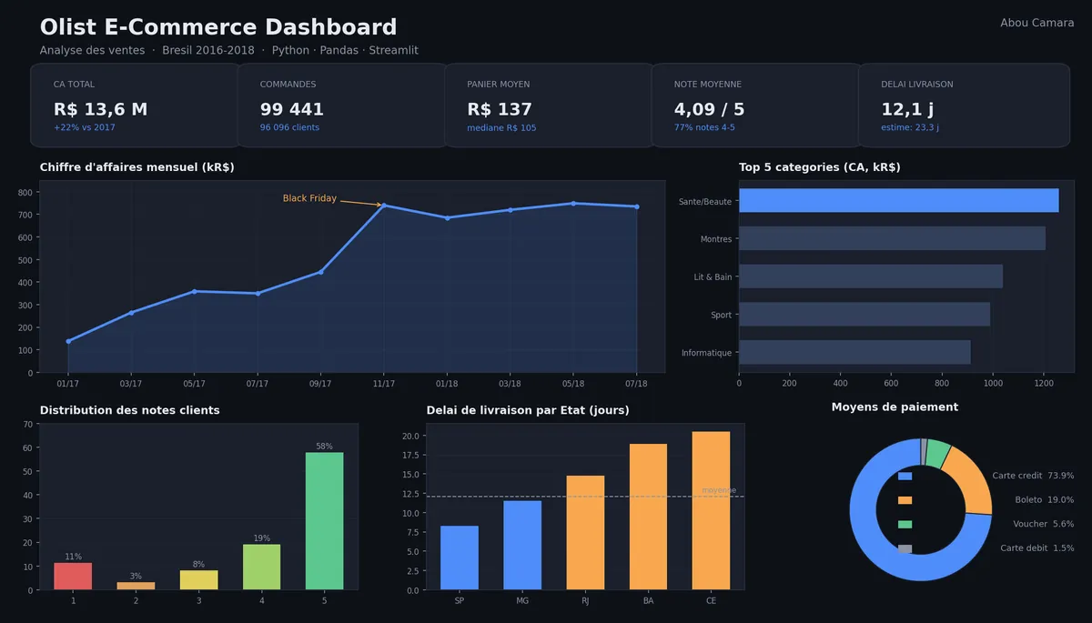
Revenue, orders and average basket over time.
Which product categories carry the revenue.
Delivery times by Brazilian state.
Review score distribution and payment methods.
01Problem
Which part of the operation costs the most?
An e-commerce business can grow its sales and still lose margin to late deliveries, unhappy customers and the wrong product mix. I wanted to find out where that money goes, using real transaction data instead of guesses.
02Approach
Start from the questions, then build the views.
- How do revenue and order volume evolve month by month?
- Which categories carry the revenue?
- Where are deliveries slowest, and does that show up in review scores?
- How do customers pay?
03Build
Clean, join, aggregate, visualise.
The Olist dataset is split across several tables (orders, items, payments, reviews, customers, products). The work is to clean and join them in Python, compute the indicators, and present them in an interactive dashboard.
04Technologies
The stack.
- Analysis
- Python, Pandas, SQL
- Dashboard
- Streamlit
- Data
- Brazilian E-Commerce Public Dataset by Olist
05Real outcome
Not finished yet.
A first version of the dashboard covers sales, top categories, review scores, delivery time by state and payment methods.
Not finished. The figures in the screenshot come from the public dataset, not from a client. I'll share conclusions with the write-up, once I've checked them.
06Visuals
Current dashboard.
Sitting on data?
Let’s see what it tells you.
If you have sales or customer data and aren't sure what to do with it, a dashboard is often a good place to start.
Work together